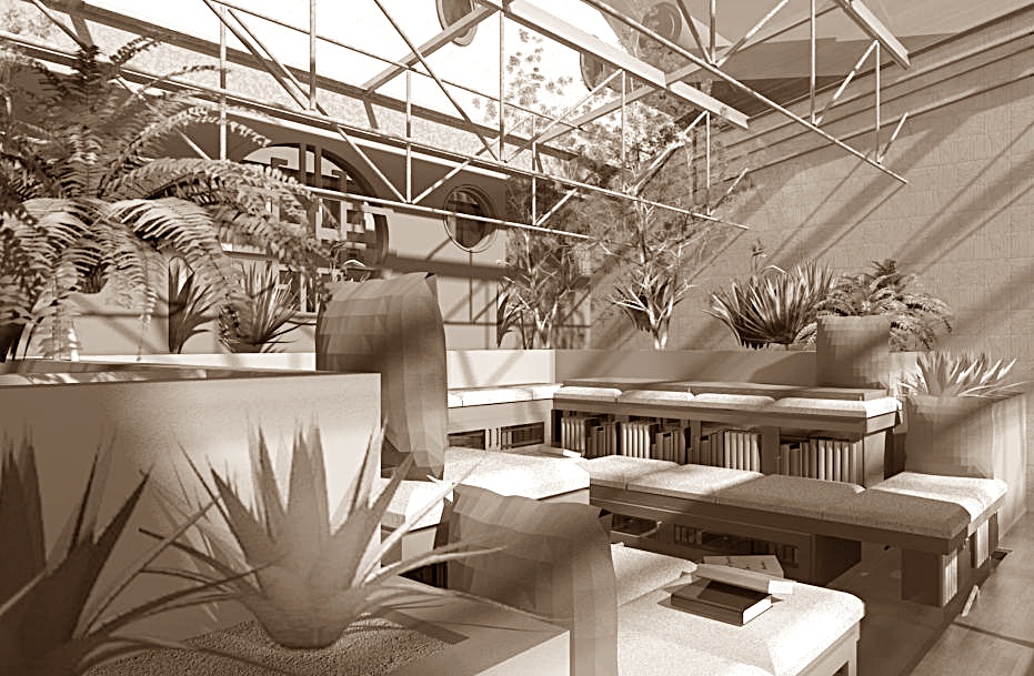
We all use the web so much browsing became our second nature. We wander from site to site, following our interests and stumbling upon new ones in the process, unaware that if this digital journey happened in the real world it would be akin to traveling from New York to Tokyo via Johannesburg.
Like driving a car or playing an instrument, once we learn how to use the internet our brains put the necessary hand-eye coordination on autopilot to enhance the efficiency of our thinking processes. We are then able to focus on the actual content and not on the way we access it.
I compared a web page structure with the design of a building, and if you want to know what a house would look like when designed by web standards, here goes:
1. Main navigation – the dwelling would have no corridors or stairs, there would be a large hall at the entrance, full of doors leading directly to the different functions.
2. Ajax loaded sections – one would be able to flip a switch and a section of the room would change to display library shelves instead of a seating area.
3 Archives – all your winter sweaters, Christmas decorations and nostalgic mementoes will have an expiration date attached, after which they will automatically be stored in an alphabetized archive.
4. Dockable sections – one would be able to push the upper cabinets back into the ceiling after reaching for the sugar or the cups to maximize kitchen real-estate and glazed wall area.
5. Links – direct access to rooms in other people’s houses, just because you know their address. Imagine opening what looks like a closet door and ending up in a stranger’s living room, half way across the world.
6. Consistent page structure – the house would be an endless repetition of the same room, organized as a nine square grid, and where all the important functions happen straight in front and slightly to the left of you, with a smaller focal point in the front right corner.
7. Mobile version – you would be provided with a version of your home to go, and it would have the same features as the main one, linearly organized in a much smaller space. Basically all homes would come with an RV.
8. Tag cloud – next to the front door there would be a pile of cooking pots, keys, phones, laptops, favorite shoes and coats, cat food, kids’ backpacks, toothbrushes, and reading glasses, all laying in a disarmingly random array, and the objects’ sizes would be determined by the frequency of their use.
9. Search – when you wonder where your scarf is you’d be taken to it instantly. Also to all the other scarves you have, the gloves that match it, your cat whose name is Scar and the newspaper that featured a story about haberdashery that day. All at the same time.
10. Cloud hosting – you would be able to use your key to open any door to get home.
11. Multiple windows and tabs – You could be in several houses at the same time or switch between them at will.
12. Push notifications – Someone would show up regularly to inform you a package was delivered to your door or remind you about your dentist appointment.
13. Sheer displays – You would have transparent walls so you can see through a room to the room behind it when searching for something.
Last but not least, if your home was not well designed you would eventually wander off into a maze of rooms and never be able to find the front door again.
Though this is a somewhat tongue in cheek commentary on the differences between the digital and the brick and mortar world, some of these space descriptions come very close to established patterns in architectural design that have been around for generations.
Some were abandoned for a more efficient use of space, such as the enfilade of rooms, other still guide the layout of a house: the large hall at the entrance, the focal point placed such that you don’t have to turn your head, a repetitive room configuration guided by the basic principles of structural efficiency and potential for adaptive reuse. The use of translucent walls to partition interior spaces offers great potential for day lighting deep into the core of a building, far from perimeter walls. The tag cloud at the entrance is a functional reality for most of us I’m afraid, despite our best intentions.
I tried to imagine what the space would look like, based on this description, and it looks very much like a honeycomb.


